Empower Your React & Next.js Applications with Lumina Design
A lightweight, highly customizable UI component library with 1400+ SVG icons, built for seamless theming and no external dependencies.
Why Choose Lumina Design?
Discover the features that make Lumina Design the perfect choice for your next project.
Lightweight & Fast
No external peer dependencies, ensuring faster load times and minimized risk of external vulnerabilities.
Highly Customizable
Theme support with out-of-the-box customization options tailored to your needs.
Seamless Icon Integration
Access 1400+ SVG icons as React components with simple imports and easy customization.
Optimized for React & Next.js
Built specifically for modern JavaScript frameworks, ensuring compatibility and smooth integration.
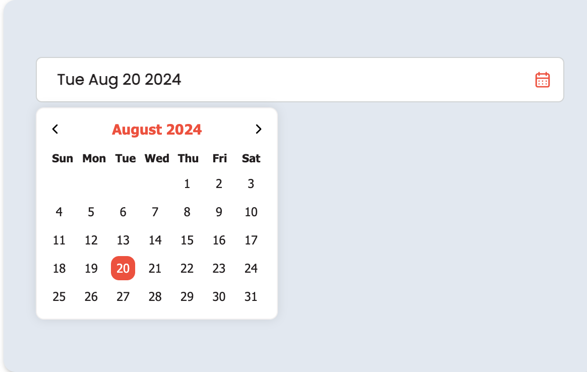
Explore Our Versatile Components
35+ UI components tailored for every need, from buttons to complex carousels.
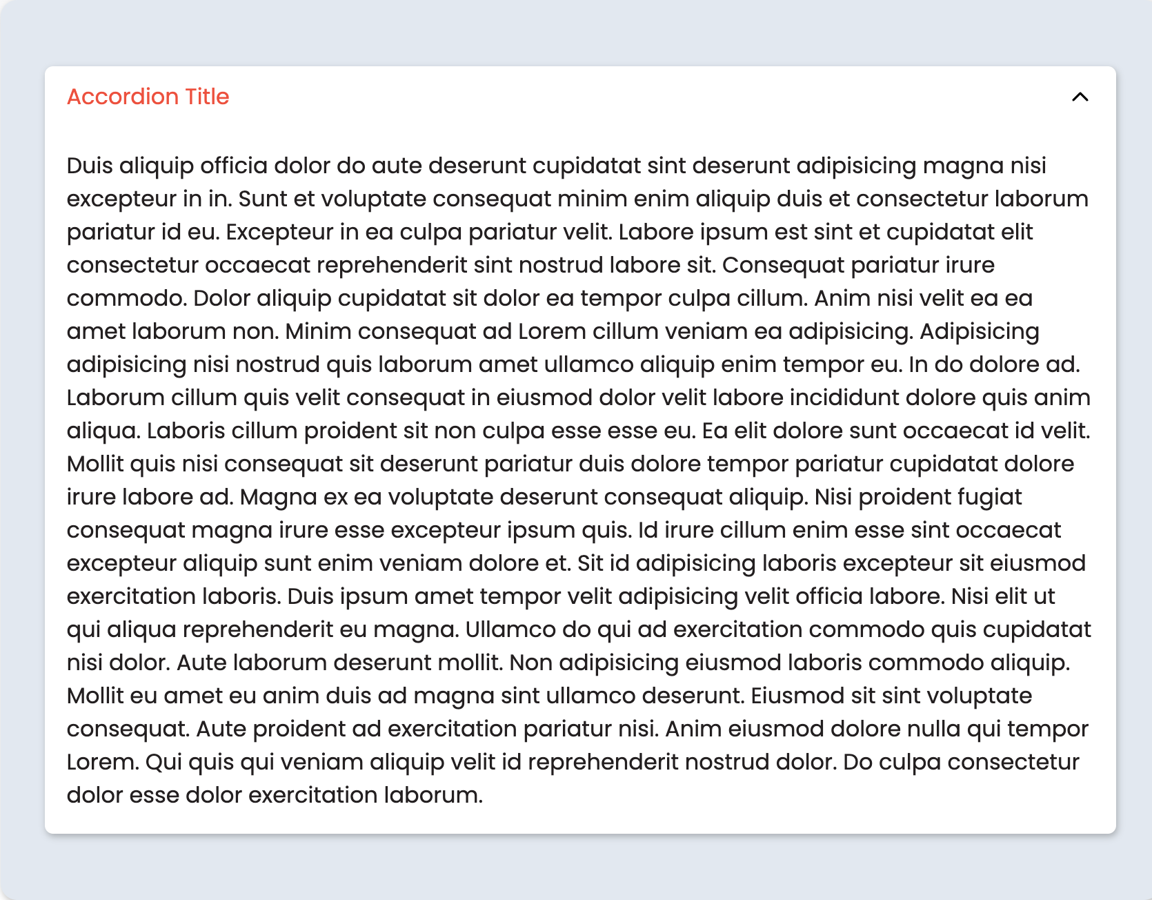
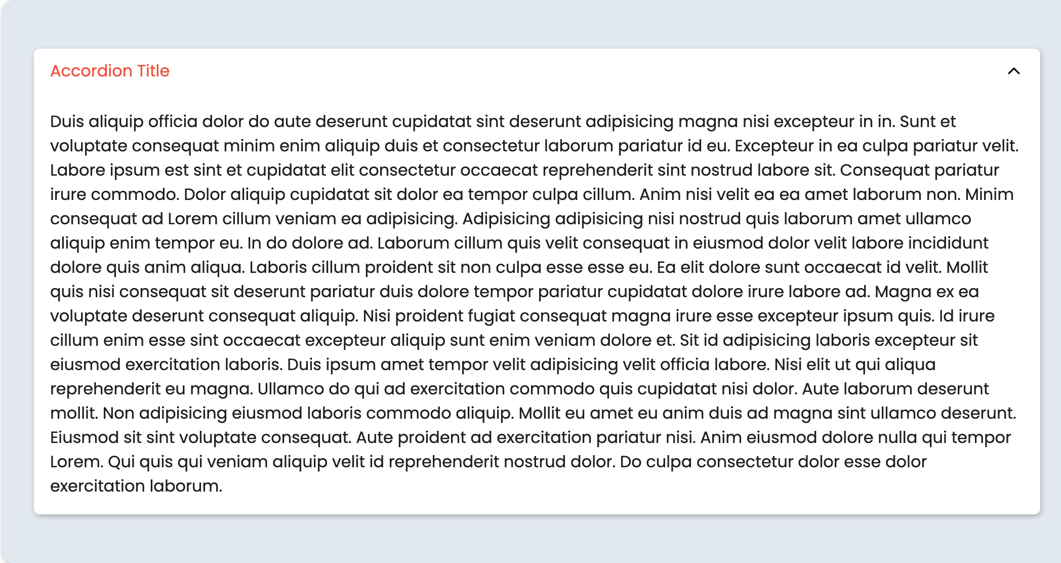
Accordion
Create collapsible sections to display content in a clean, organized way.
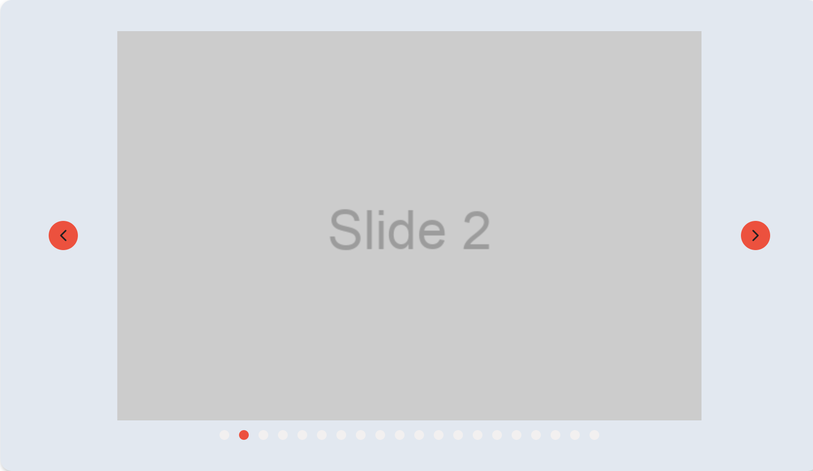
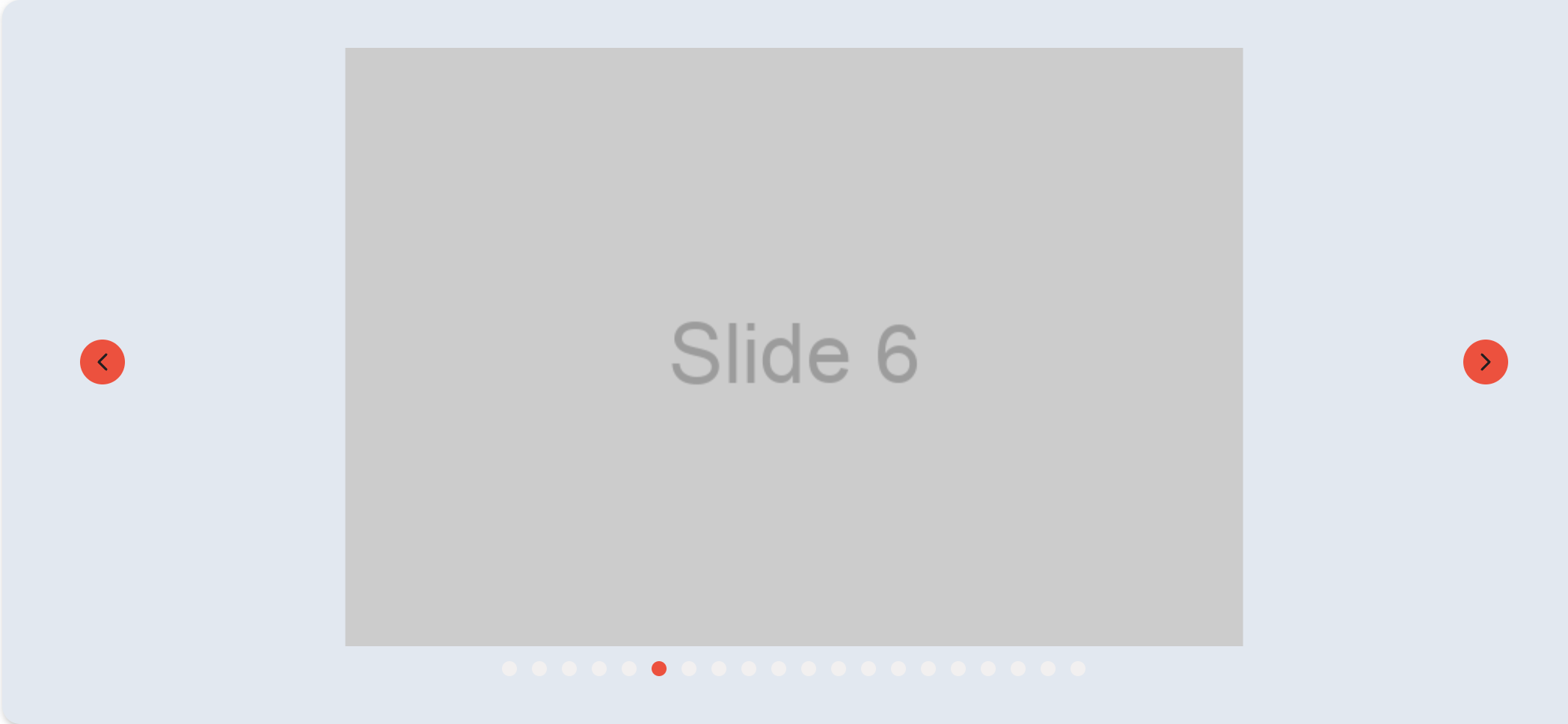
Carousel
Display multiple items in a swipeable, responsive carousel layout.
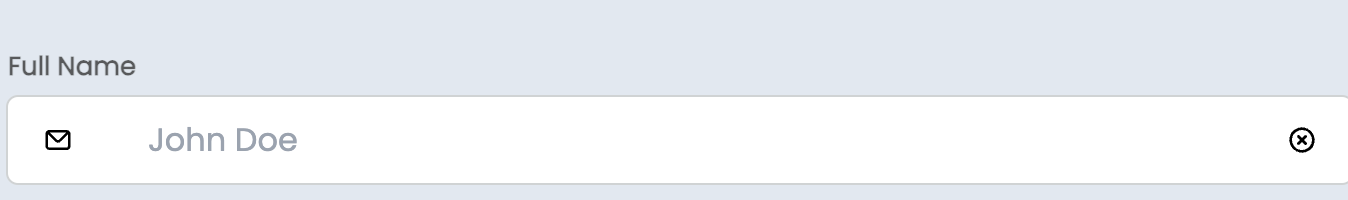
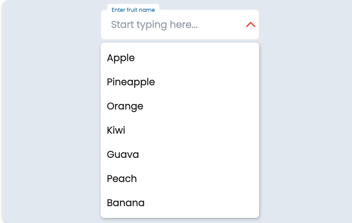
Input Field
Capture user input with a variety of customizable input fields.
Discover Our Extensive Icon Library
1400+ SVG icons available as React components, fully customizable and lightweight.
Feather
Cog
Grid
Abacus
Installation & Getting Started
Start using Lumina Design in your React and Next.js projects with just a few commands.
1. Install Lumina Design
npm install @lumina-design/coreyarn add @lumina-design/core2. Install Icon Library
npm install @lumina-design/iconifyyarn add @lumina-design/iconifyGet Started in Minutes
Import and start building with our components and icons effortlessly.
View Full DocumentationWhat Developers Are Saying
Hear from those who’ve integrated Lumina Design into their projects.
"Lumina Design has streamlined our development process. The components are intuitive and beautifully designed."
John Doe, Developer at XYZ Corp
"The icon library is a game changer. We were able to integrate custom icons seamlessly into our application."
Jane Smith, Frontend Engineer at ABC Ltd
"With Lumina Design, we reduced our development time by half. The customization options are unmatched."
Michael Lee, UI/UX Designer at Creative Studio
Ready to Build with Lumina Design?
Start integrating our components and icons into your project today.
Get Started